Zeno Hills
A resort website, designed end to end.
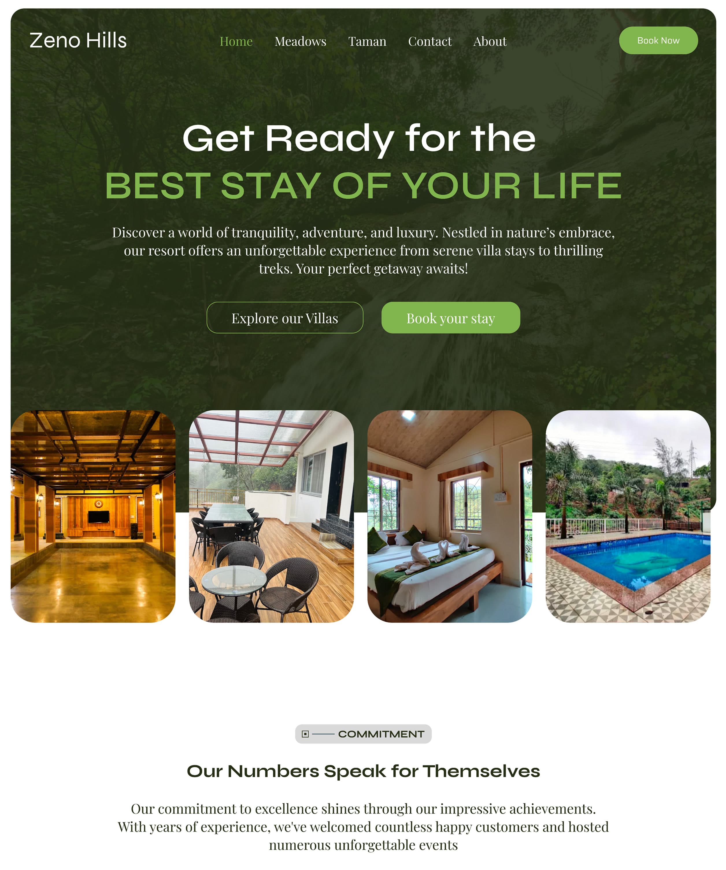
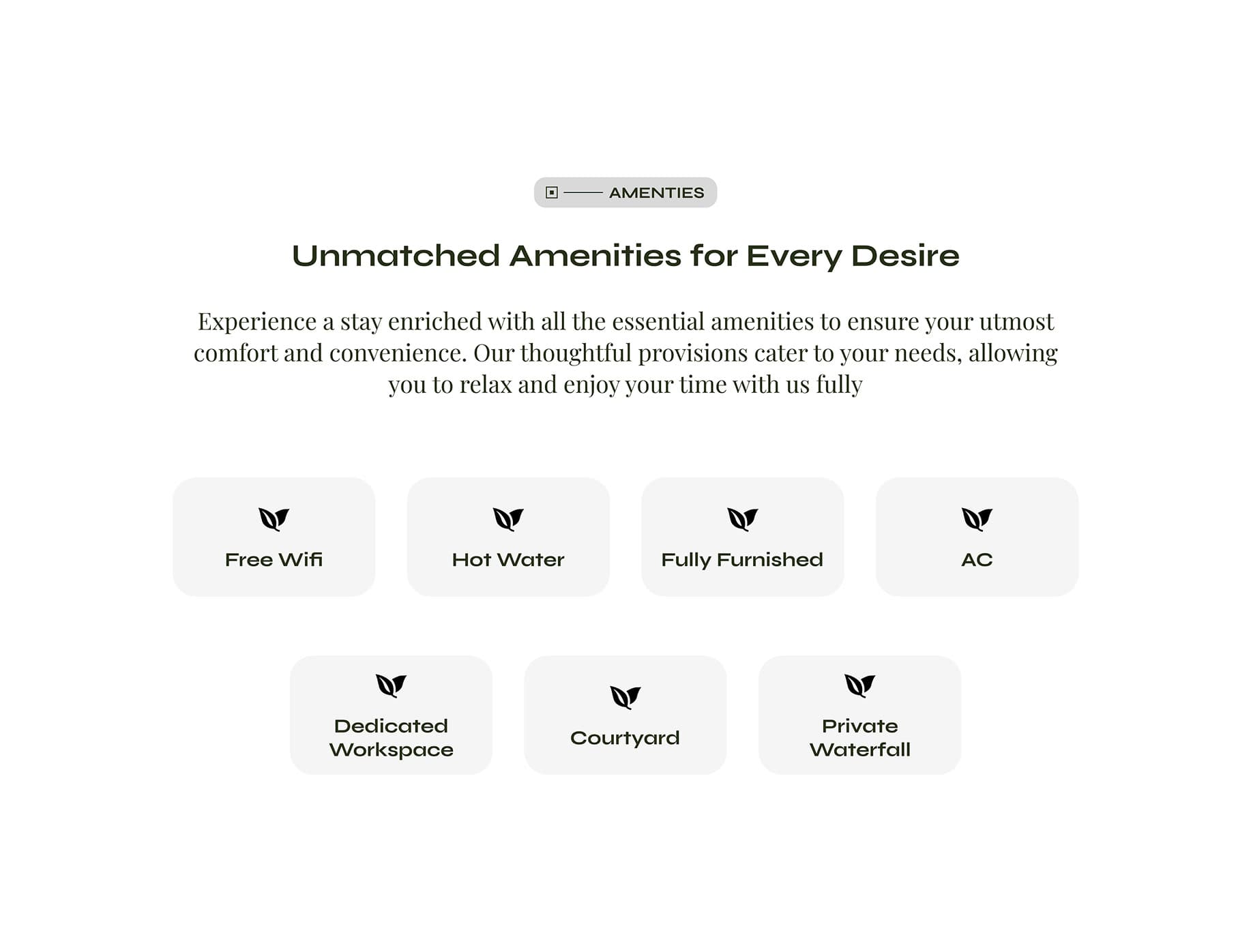
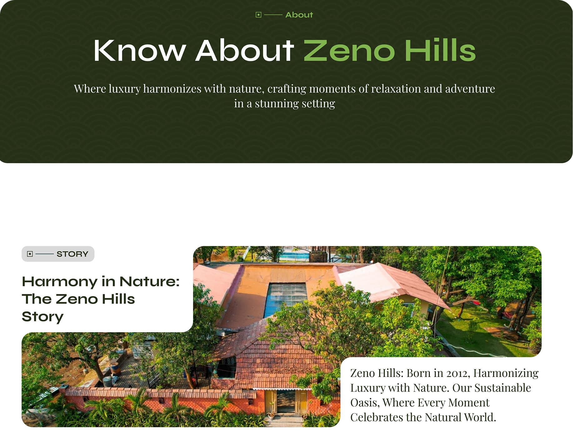
[Overview]
The resort sells itself. The website just had to let it.
Zeno Hills is genuinely beautiful — the kind of place that convinces people once they actually see it. My job was making sure the website did that seeing for them: showing enough, feeling enough, that booking becomes the obvious next step. Design wrapped, then handed off clean to developers to bring it to life.
[Competitor Analysis]
How I made the resort saleable
Went through a range of resort websites and asked one question of each: would this actually get me to book? Noted what worked, what fell flat, and what felt missing — then used that to shape the direction for Zeno Hills.
What I Noticed
[The Website, In Full]
The screens that had to do the convincing
Ten days, four competing moods, and one single website, all pulled together to look like exactly the kind of place worth dropping everything, packing a bag, and booking a stay at right now.
[Learnings]
What Ten Days Actually Taught Me
Timelines don't just limit a project. They shape it.
The same brief, given a month instead of ten days, would've turned into a completely different website — not better or worse, just different, because the timeline itself dictates the decisions. UI-wise, I could still land something aesthetic under pressure. The real challenge was UX — making the look and the logic work together without the luxury of time to test every assumption. Short timelines don't lower the bar, they just force you to choose, fast, what actually deserves your attention and what has to wait.