Physiotherapists weren't confused. They were rushed.
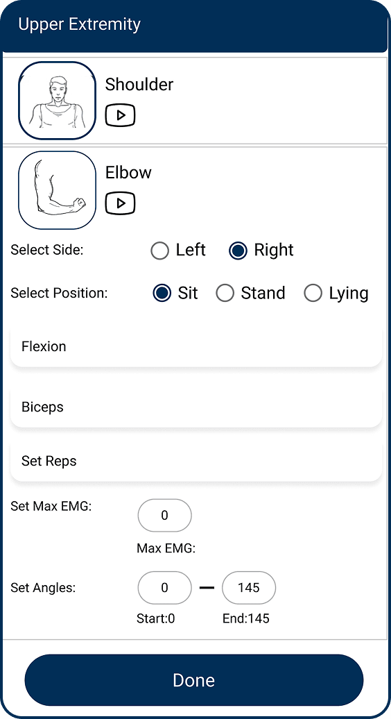
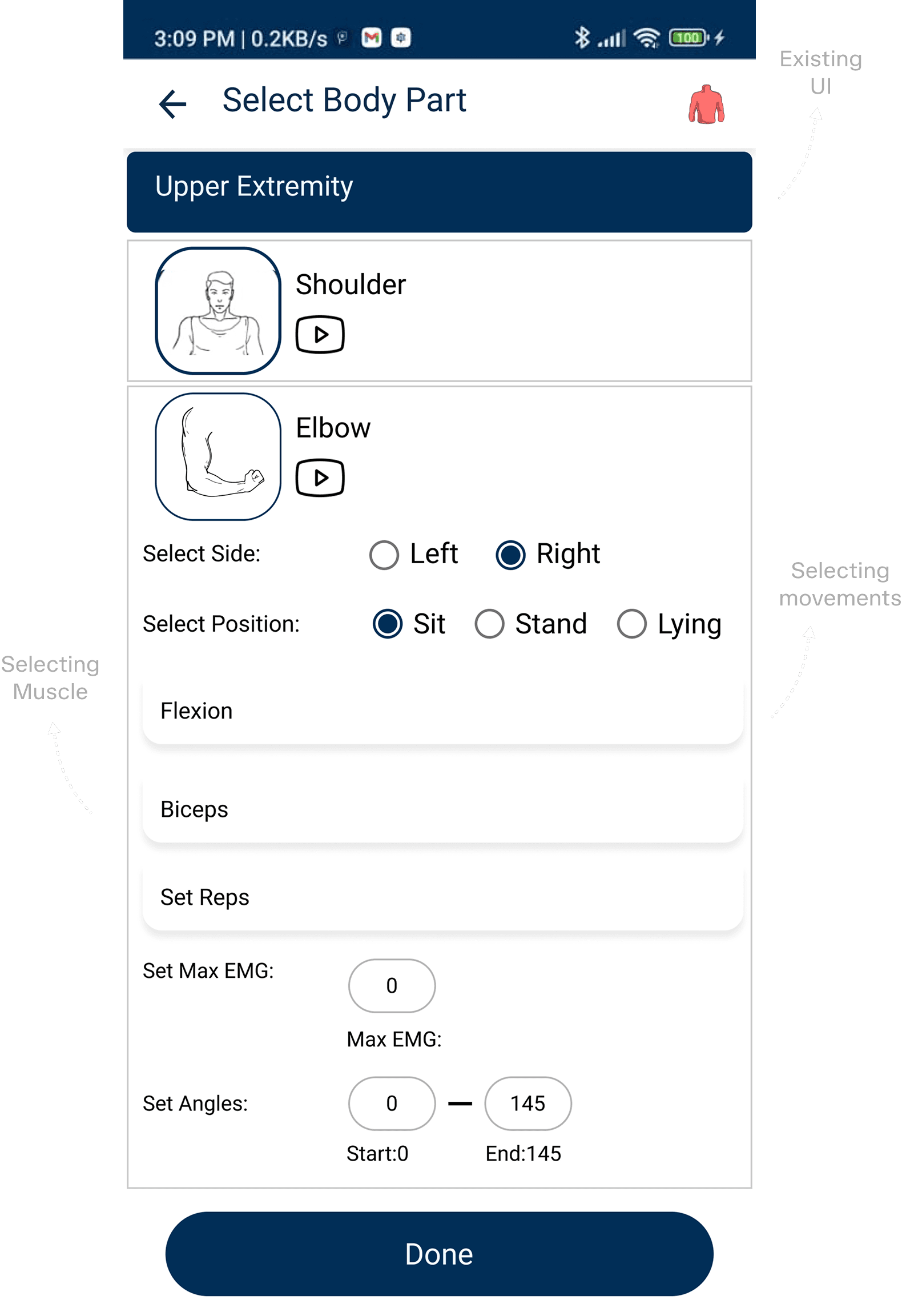
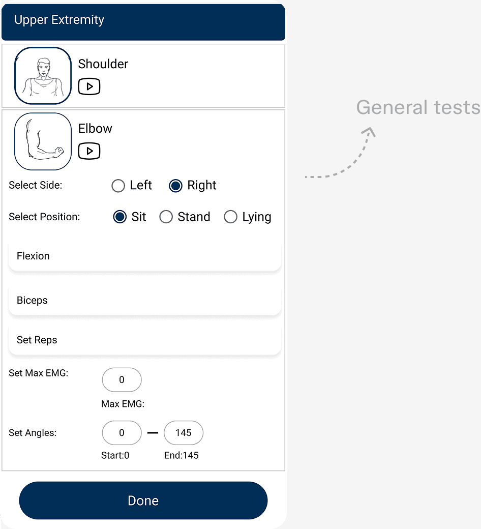
Every patient meant manually picking side, position, movement, reps, EMG range, and angle — all before starting.
Drove 65% test completion within the constraints of an existing UI.
[Overview]
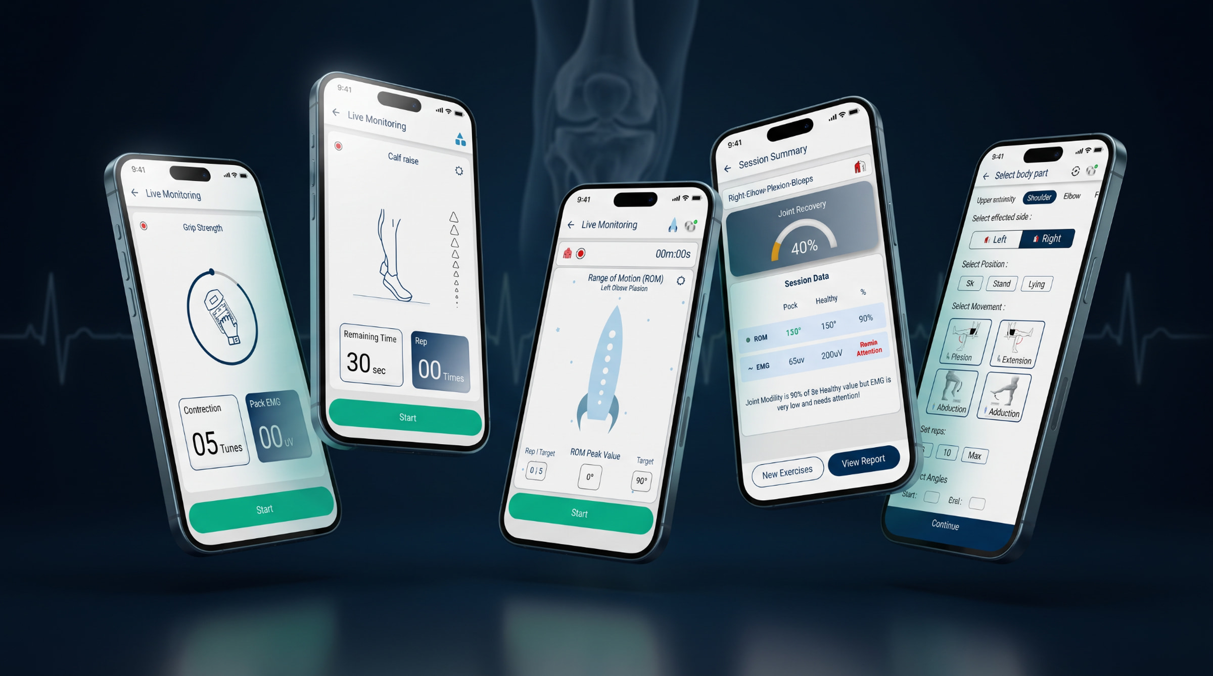
Pheezee — a biofeedback device and app for physiotherapists — already had plenty under the hood. The challenge was connecting those capabilities to the specific needs of Ortho, Neuro, Geriatrics, and beyond. The leadership team introduced Special Tests to bridge that gap, and my job was to turn that direction into an experience that actually worked. Was the gap closed? Was the design helpful? Could more specialized physiotherapists get the most out of Pheezee? Hmm... 🤔
[My Role]
Leadership had the idea and the name. Everything after that — figuring out what physiotherapists and patients actually needed, researching, sketching, testing, and shipping the final design — was on me, start to finish.
[Constrain Opportunity]
No blank canvas — just a working app, and a job to make Special Tests happen inside it, without touching what was already live. No new navigation, no new visual language. Just the existing pieces, made to work harder. A far more honest test of whether the thinking actually holds up than starting from scratch ever would be.
[Research]
Scheduled conversations got cancelled more often than they happened. So I started observing alongside physiotherapists too, filling the gaps conversations left behind. One afternoon waiting on a doctor who never showed taught me more than the interview would have — physios move between patients with almost no spare seconds.
[Problems at Hand]
They knew the right muscle, movement, and angle. They just didn't have fifteen seconds mid-session to build it from scratch — so the rush won, not the confusion.
Veterans wanted speed, no hand-holding. Juniors needed guidance, even unspoken. Spoon-feed the senior, they'd tune out. Leave the junior unguided, they'd hesitate. It had to flex both ways.
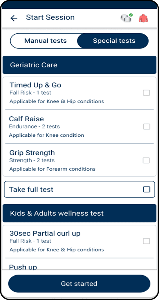
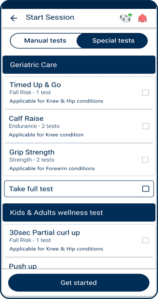
General tests showed every option, always — complete, but mostly beside the point. Physiotherapists didn't need more choices. They needed the screen to already know which ones mattered.
When a patient extends their knee, a flat line on a graph doesn't say “you're doing great.” Progress needed to feel visible, not just measurable.
[The Unplanned Finding]
I went into the field to understand what was getting in the way of the existing general tests — so we wouldn't carry the same problems into Special Tests. But somewhere along the way, physiotherapists started asking for something else: condition-specific tests. Which, funnily enough, was exactly what we were there to build.
Yeah, small world!!
I took the finding back to the team. Turns out, the demand was real — and it opened up a much bigger opportunity than we expected.
Special Tests became a premium feature on its own.
[Ideating & Sketching]
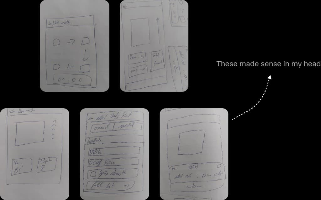
These weren't meant to look pretty. They were made to help me visualize the UI — exploring layouts, screens, and flows quickly before turning the ideas into the actual interface.
[Usability Testing]
Real user testing wasn't on the cards, so I tested with hardware engineers, production folks, and people with zero physiotherapy background. If they could navigate it without getting stuck, I knew I was onto something. A few rounds. A few fixes. A very different final design.
[And Then, Pixels]
From the first rough screens to the polished experience, the design went through plenty of rounds — refining the flows, hierarchy, and details until everything started making sense.
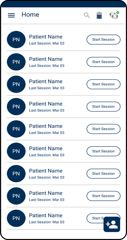

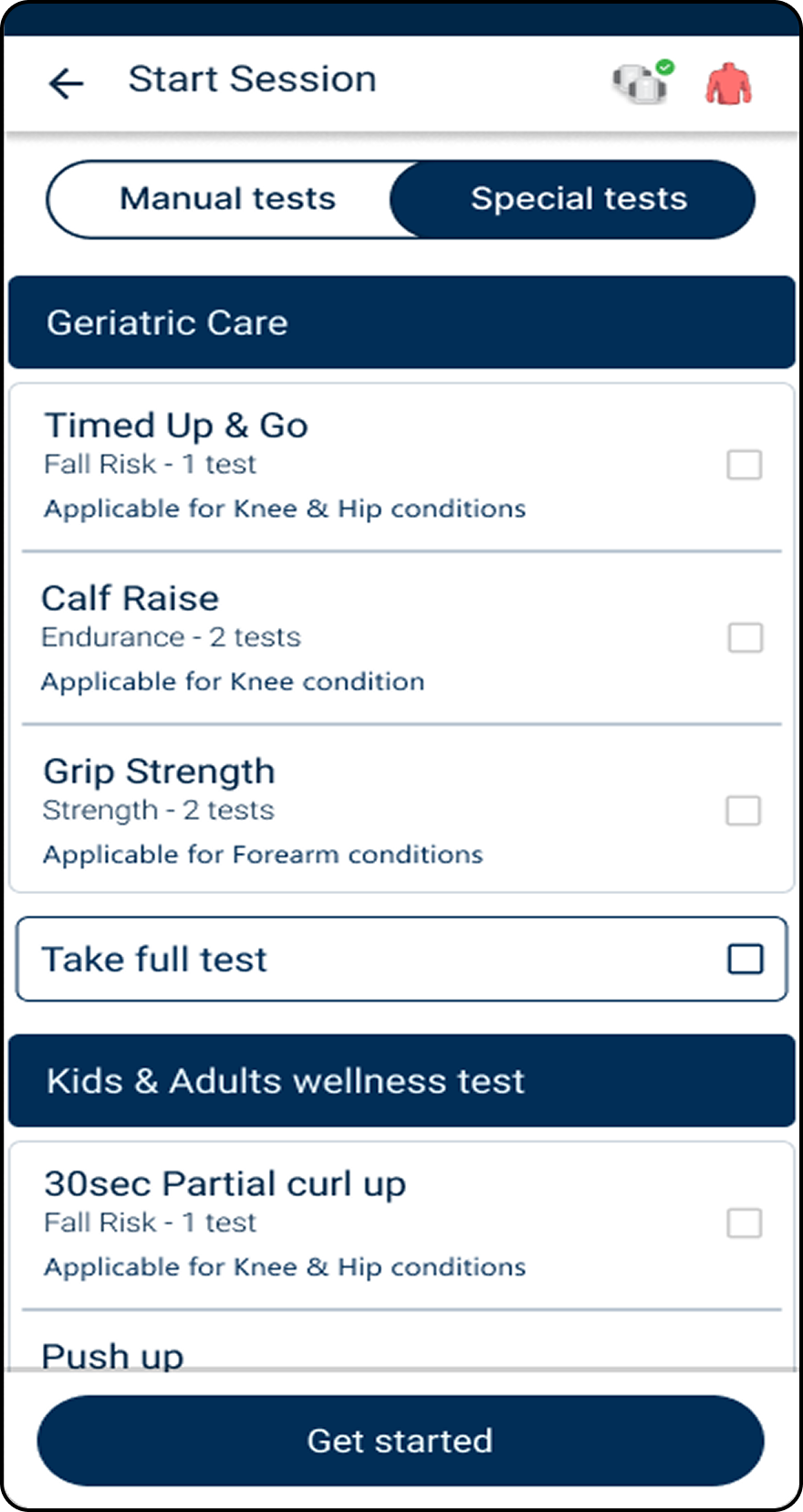
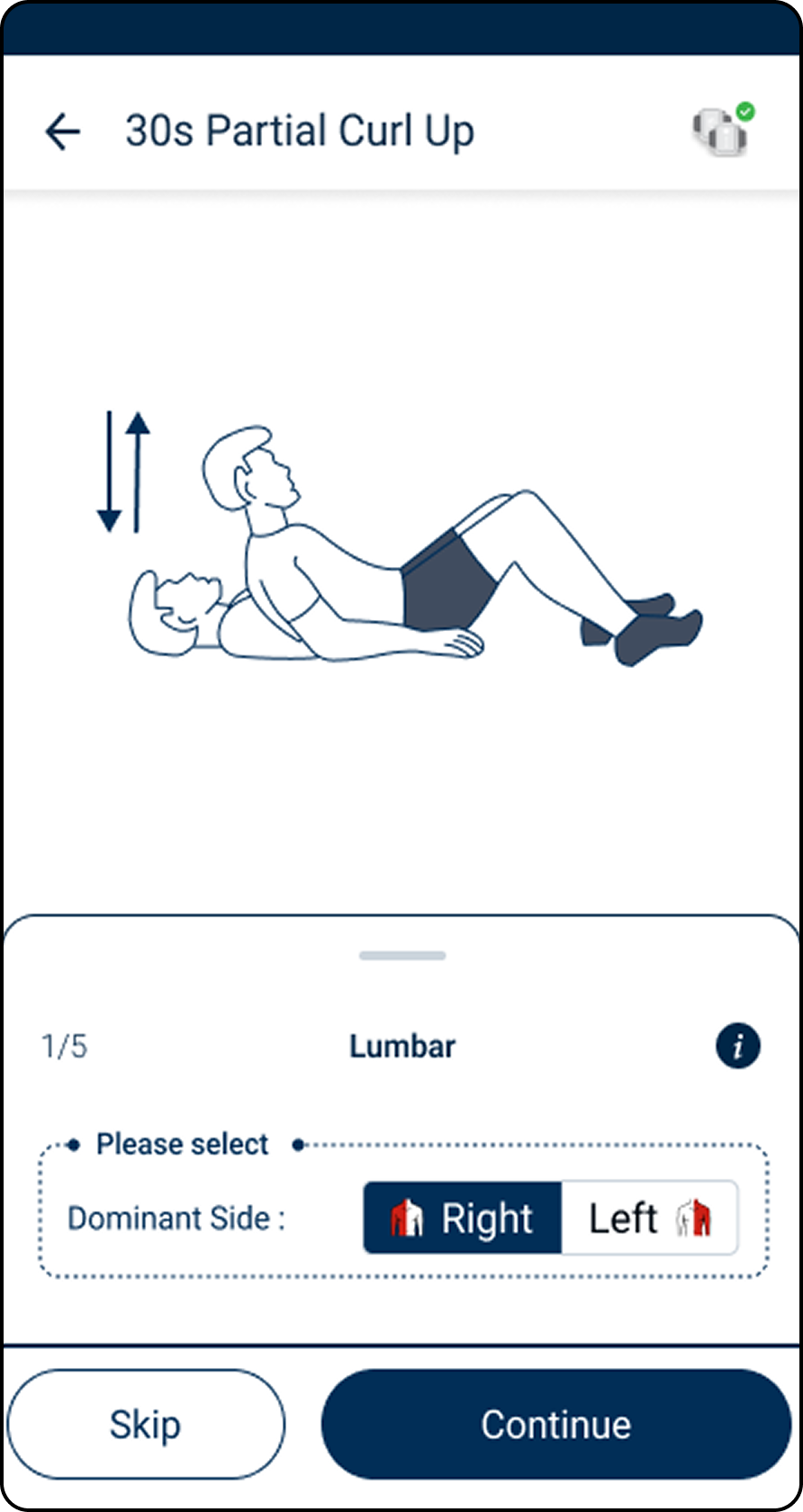
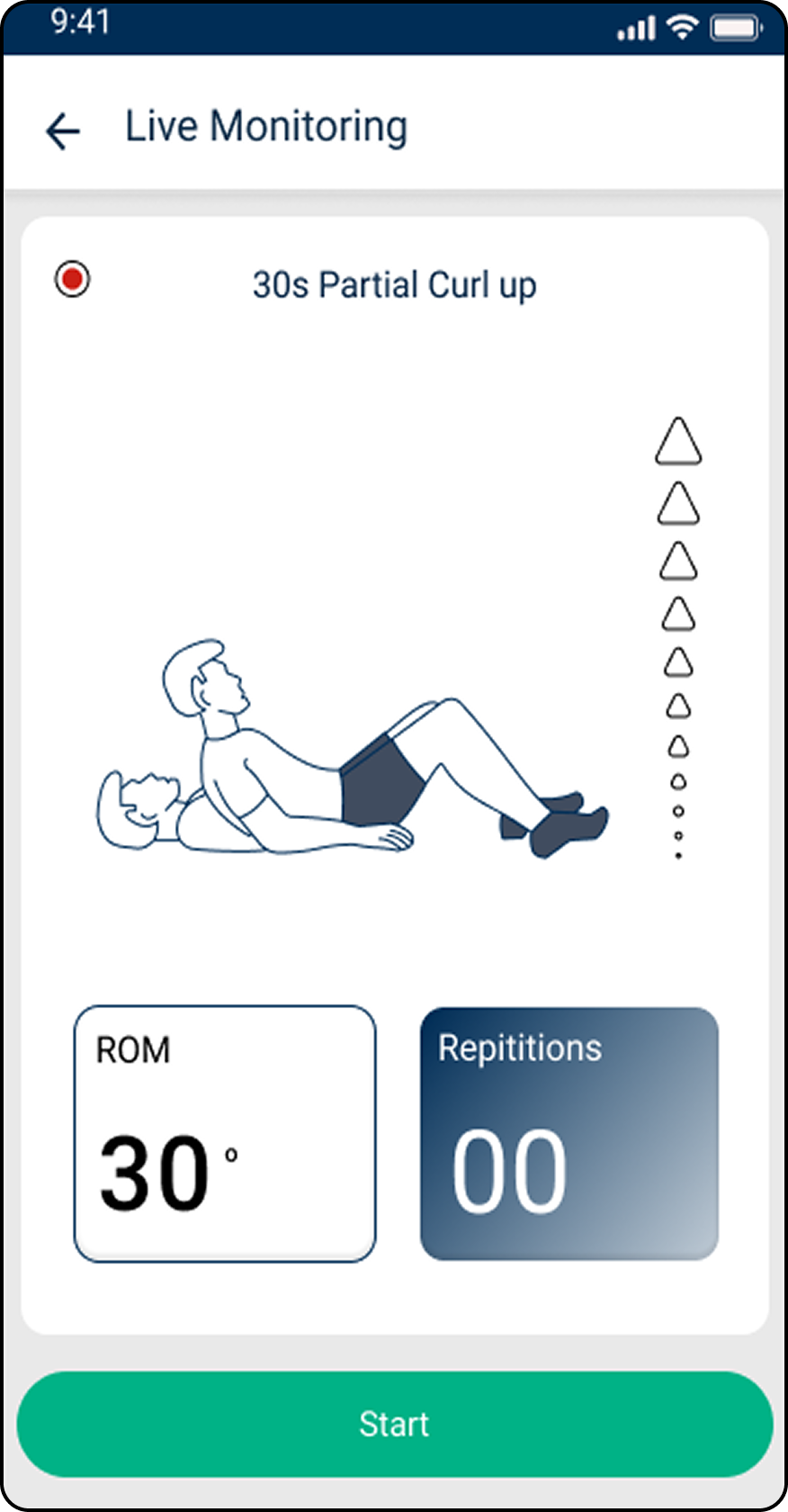
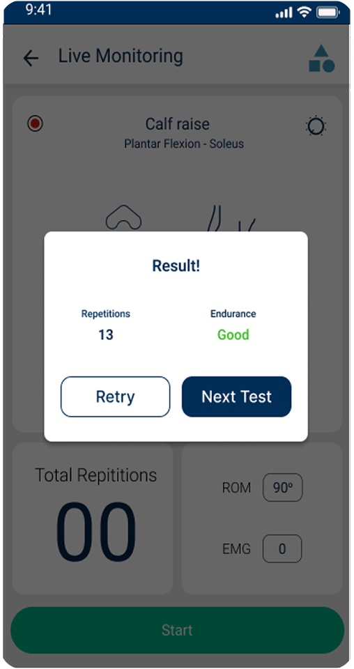
A quick note before you scroll: none of this was designed to show off. It was designed to disappear into a physiotherapist's workflow and quietly make sense to the patient on the other side. If it looks simple, that's the point. Not an accident.
[Okay, Let's Break This Down]
Here’s where each problem meets its solution — a quick look at the decisions behind the screens and how they came together.
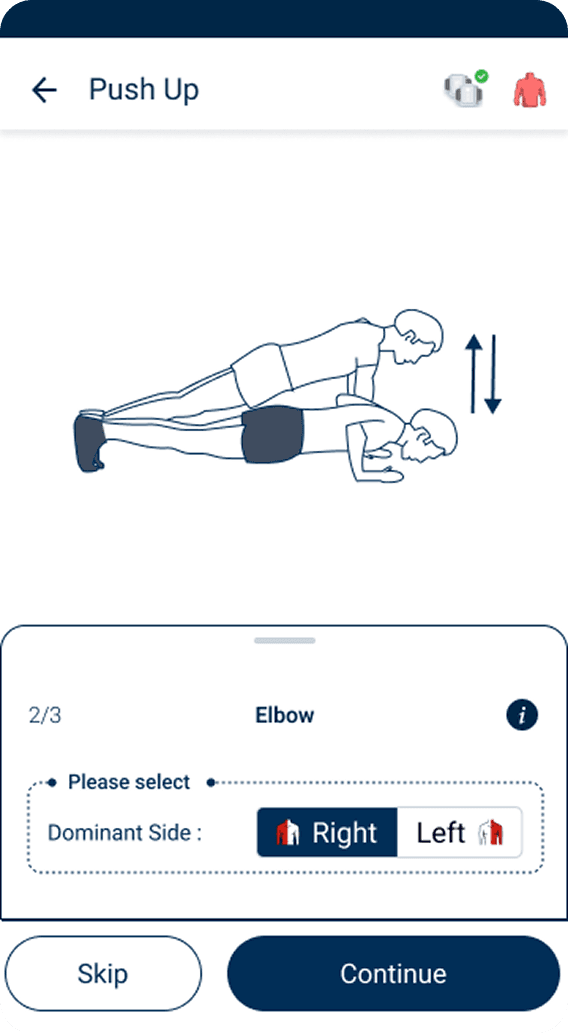
1234Every patient meant manually picking side, position, movement, reps, EMG range, and angle — all before starting.
One selection now does the work six used to.
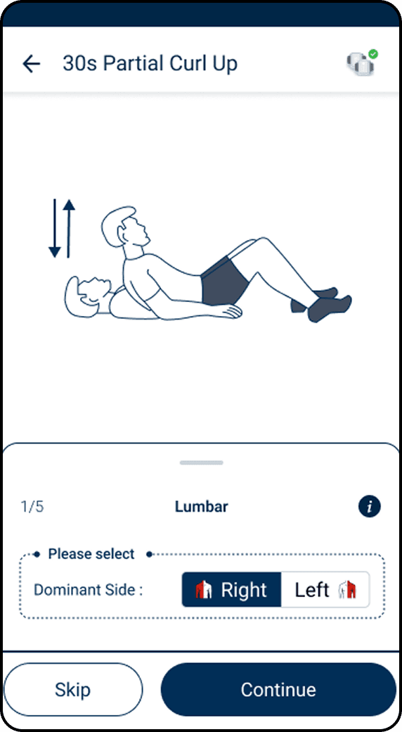
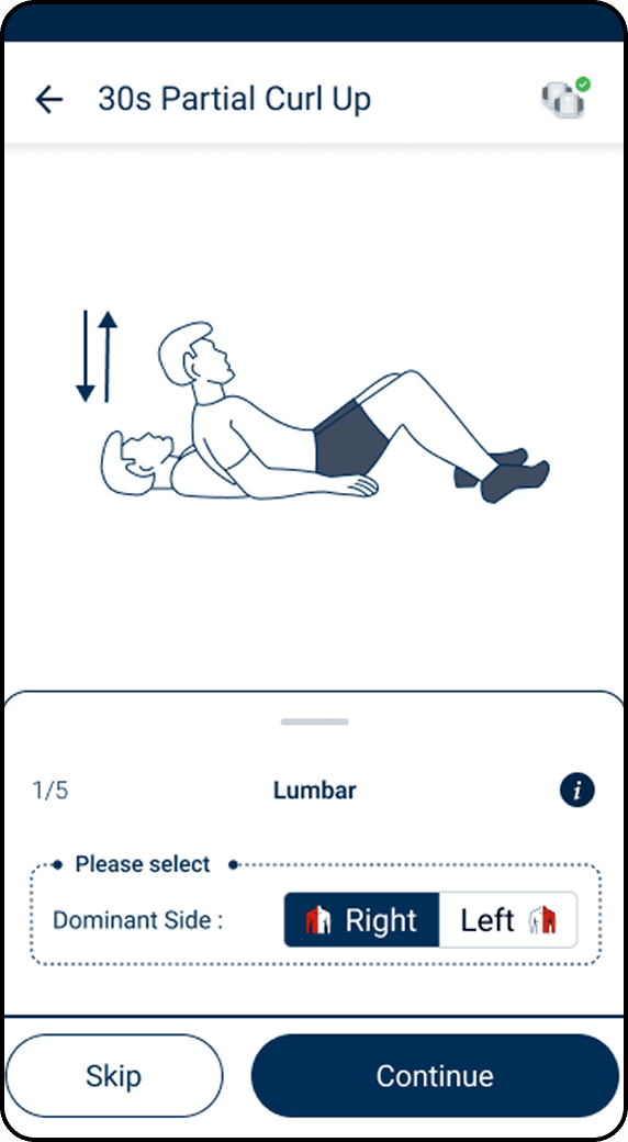
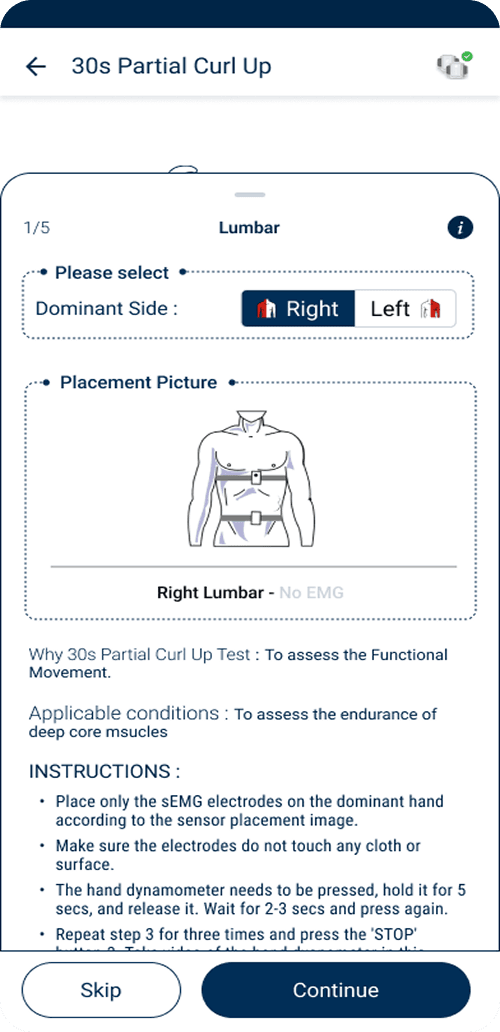
Same detail, same instructions, whether it was someone's first test or their hundredth.
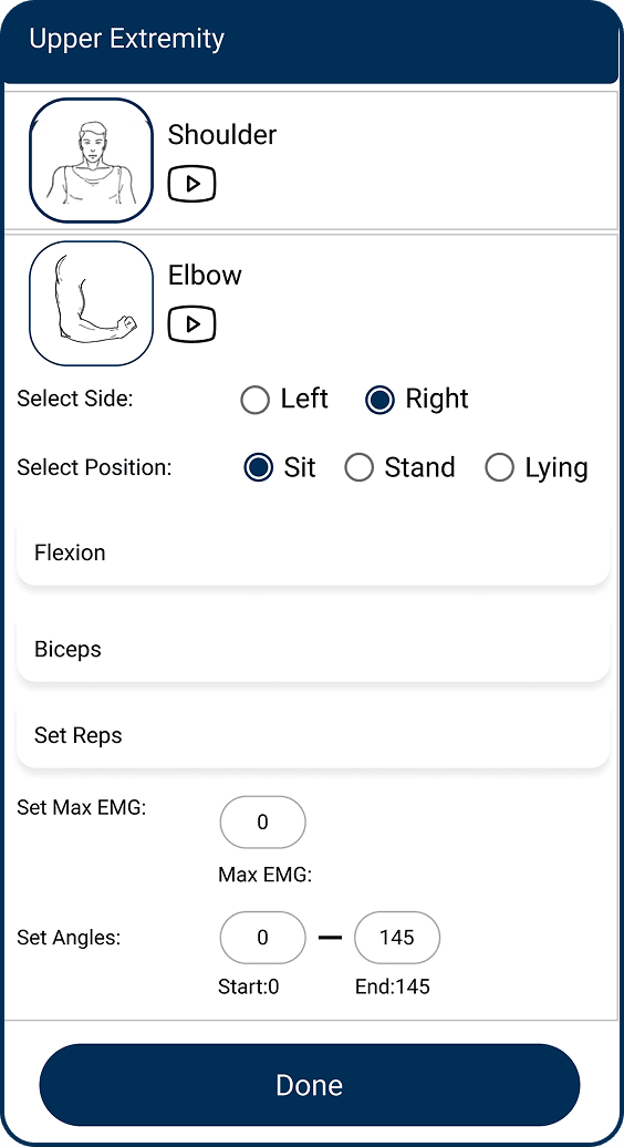
Veterans get a clean screen. Juniors get a teacher, one tap away.
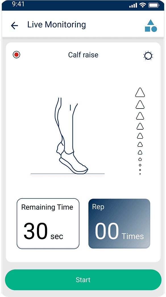
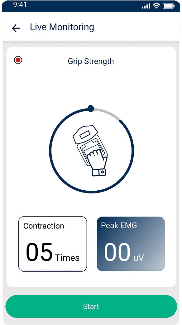
A number or a graph line, mid-exercise — accurate, but meaningless to a patient just trying to finish.
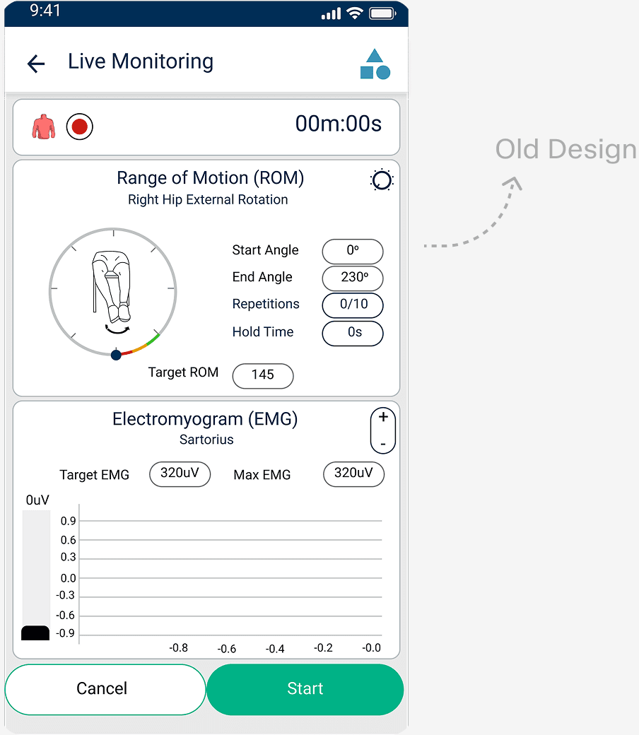
No numbers to read. Just proof the next rep counted.
Every field, every setting, every time — regardless of what the case actually needed.
Pick Ortho, Neuro, or Geriatric — the screen adjusts itself.
[Impact]
Special Tests brought in new users who came for this feature, and physios ran more tests because of it. It launched as a premium feature, and revenue grew once it went live. Here's how it played out in numbers.
[Learnings]
Sometimes, it's about helping people understand the value of what's already there.
I learned to find different ways to understand their needs, behaviours, and the problems they were facing.
Sometimes, the best interface is the one that quietly gets the job done.