[001]
PHEEZEE
- RESEARCH
- UX
- FIELD STUDY
[Projects]
[My design arsenal]
Careful, someone just cooked hard!
Just a few ingredients worth flaunting
Three-plus years of turning “this is confusing” into “oh, that's obvious.” Healthcare, hospitality, mobility, wellness — different worlds, same instinct: simplify first, decorate later.
[001]

[002]

[003]
[004]
The skills? The usual suspects. The tools? You'll see. The stories? huh! That's a whole thing — grab a seat for Part 1 and Part 2. You'll need it for the plot.
25+ Interviews
Used thoughtfully in physio and fintech
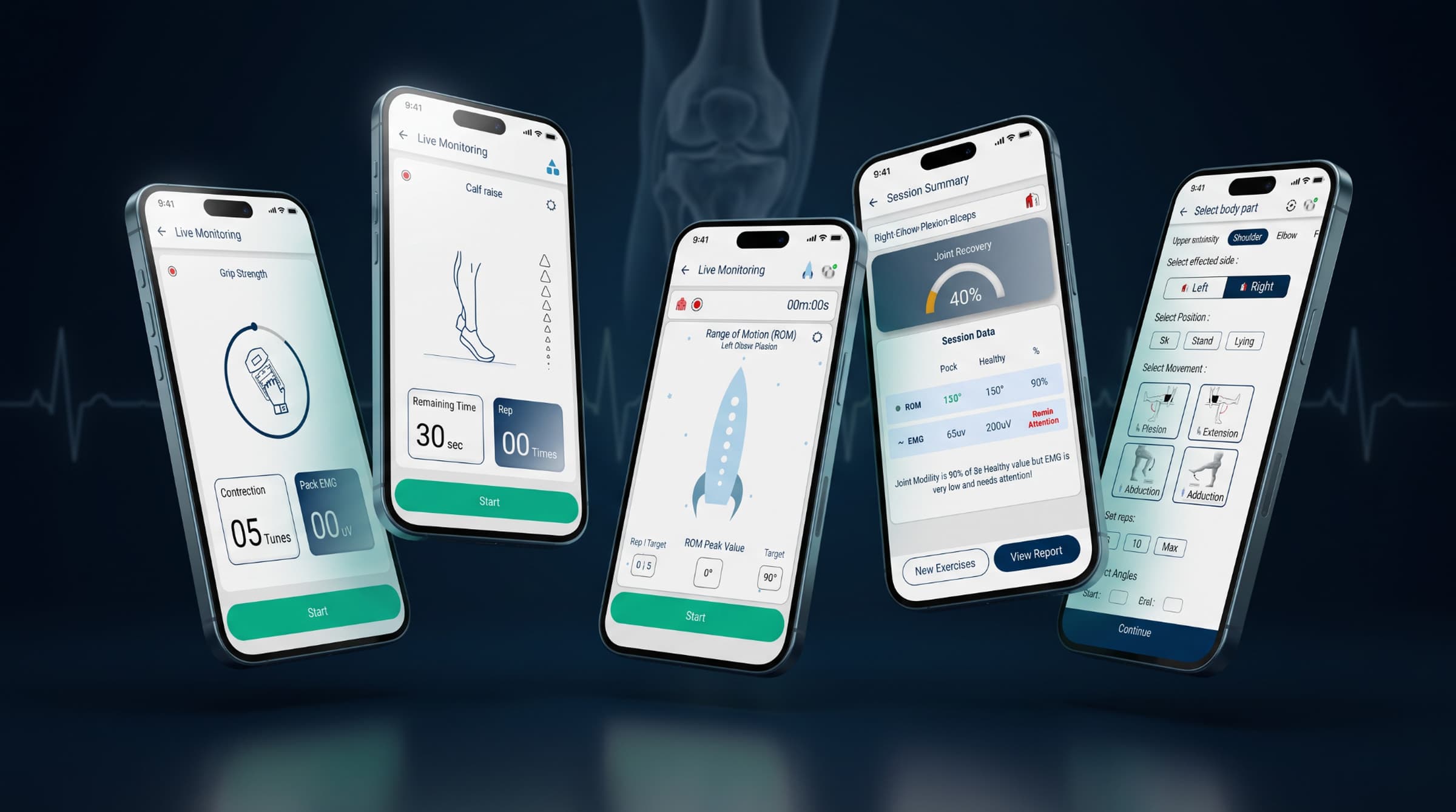
Physio App
Neurosurgeons don't give you 30 minutes. So I stopped asking, and started tagging along instead.
No clipboard, no formal interview — just me, quietly shadowing a physio between patients. Turns out people talk more freely when you're not "the guy taking notes." Neuro patients one week, ortho the next — same app, entirely different humans each time.
Fintech App
Slipped in a few sneaky questions between the obvious ones — decoys, really, to get past the rehearsed answers.
"What's the first thing that comes to mind when I say money?" told me more about people's fears than any spending habit ever could. Asked about their history with money before I asked about their habits — had to understand what money meant to them before I could design around how they used it.
Meaningful Interactions
On Pheezee
Physios were running between patients with no time to watch a screen, so motion had to earn its place. Nothing animated for show. Every transition either saved a tap or told them where they were.
The one place I did lean into motion was for the patient. A graph can't tell someone they're doing great mid-exercise, so I built a stack of arrows that lights up as they move, with the last arrow as the finish line. Nobody has to read anything. The patient just chases the light.
Same discipline both ways: if an interaction doesn't help someone do the thing faster or feel sure about it, it goes.
Interactive
Used in every project
The most fun step, hands down, and criminally underrated.
This is where it stops being theory and starts being something you can click through. Most fancy and most underestimated part of the whole process, in my opinion.
End to End CX
Used thoughtfully in physio and payment
Physio App
Couldn't interview anyone. So I just... watched. Suspiciously closely.
Went in for an interview once, doctor never showed. While waiting, I noticed physios running from patient to patient with zero spare seconds — which killed any idea I had of a motion-heavy, pretty UI nobody would have time to look at. Best insight of the project, and I didn't even ask for it.
Payment App
Did the same kind of quiet watching in shops, at checkout counters — wherever a real transaction was actually happening.
Nobody narrates their own behavior accurately. So instead of asking people how they pay, I watched how they actually paid — the fumbling, the hesitation, the habits they didn't know they had.
20+ modules
Used across physio, payment, and wellness
Coming out of ideation with a pile of insights and zero idea how to structure them — that's where this part earns its keep.
After ideation, you've got lots of insights but no clear path through them, especially with limited steps or resources to work with. This is where that chaos actually gets untangled into something someone can navigate — organized into clear modules, not just dumped onto a page.
Mobile <-> Desktop
Used in every project
Built once, bent to fit every screen it landed on.
Every project had to hold up across devices, from a phone mid-session to a desktop during a review.
From Scratch
Used thoughtfully in physio
Built one for Physio Care, just didn't chase it all the way to tokens.
Documented the patterns as the app grew so things stayed consistent. The token system is the honest gap.
WCAG Aware
Used thoughtfully in physio
Bigger tap targets, better contrast, readable fonts. Built for older eyes and thumbs.
Physio patients skew older, so this was a practical need, not a checklist item.
Rapid Exploration
Used in every project
Usually sketch, then jump straight to design. Still figuring out if that's a flaw or a flex.
Paper sketch, then straight into high-fidelity. Faster, but a habit worth questioning.
Gap Analysis
Non-negotiable, every project
Know the neighborhood before designing the house.
Even with zero overlap, it shows what "normal" looks like before I decide to break from it.
Domain Deep-Dives
Used thoughtfully in fintech
Built a UPI app where you could manage money right after paying. Which meant reading actual RBI guidelines, for fun.
I read the RBI and UPI rules before sketching a single screen, so the design stayed inside them.
my longest relationship
Fast, over-tinkered
Building this, quietly
Takes it live
Ideas, clickable
Learned, standby
Never called on
Second pair of hands
Graveyard, intentions
Turns out asking ‘why’ one question too many, and reading people a little too well, is basically design's entire job description. Got here the scenic route — biology, engineering, a developer detour — before UI/UX finally clicked and stuck. I also taught it, through a Tamil Nadu government initiative, watching students go from ‘what's a wireframe’ to shipping real apps. Ten out of ten, would detour again.
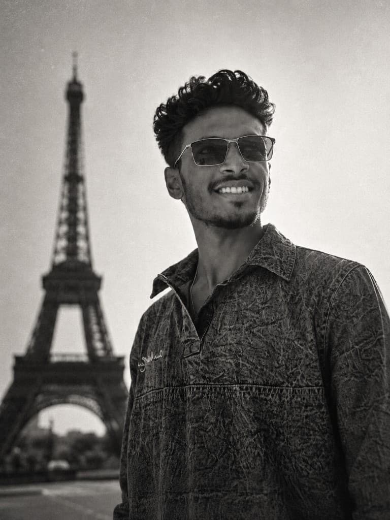

Turns out explaining design teaches you more than doing it.
Professionally lost in new cities.
Chases views my legs immediately regret.
Has opinions on fielding placements nobody asked for.
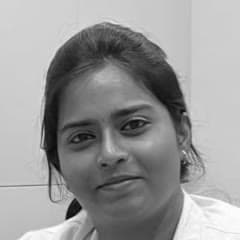
Dr. Harshavardhini
[Head of Physiotherapy Team]
Aravind is a proactive and logical thinker with a passion for creating exceptional user experience. He always integrates thorough user research into his design process, ensuring that every solution in a deep understanding of user behaviour and preferences. As a problem solver, he consistently delivers innovative and effective solutions that address complex user needs, resulting in user centric designs.